Build your first chart
Someone asks how many applications run in SaaS, or which ones reach the end of their contract. A chart answers at a glance, from your assets. It updates by itself when the assets change, and a click on a slice shows the assets behind it.
This guide takes five minutes. You will create a chart, choose what it counts, change its shape, then export it for a presentation.
Before you start
- You need to be able to create visualizations. If the Create chart button does not show, ask an administrator.
- The chart splits your assets by one piece of information, for example the hosting. This information must be filled in on your assets.
1. Create the chart
Open Visualizations in the top bar, then Charts. Click Create chart.
Give it a name that says what it shows. Under Space, choose Personal to keep it for yourself, or Shared for authorized members of the organization. Access depends on the chart's access domains and each member's content rights. Choose the folder under Destination, then click Create. The chart opens, with its settings in the panel on the right.
2. Choose what you count
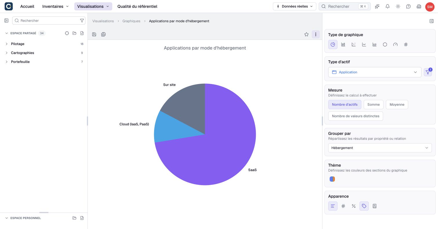
In the panel on the right, choose the Asset Type, for example Application. All assets of this type go into the chart.
Under Measure, keep Assets count to count the applications. Sum and Average compute on a number, such as a cost: choose it in Measured property.
Under Group by, choose the information that splits the result, for example the hosting. The chart draws itself right away: one slice per value. For a list property, slices and legend follow the choices’ order configured in the metamodel.
3. Change the shape of the chart
Under Chart type, switch from a pie chart to bars or a radar to keep the hosting grouping. A line requires a date or numeric grouping: choose a compatible field after switching. A gauge or a single figure removes the grouping and shows an overall measure.
For bars, Breakdown adds a second split, for example the hosting by status. Theme changes the colors. Appearance shows the values, the percentages or the legend on the chart.
4. See the assets behind a slice
Click a slice, a bar or a point. A panel lists the assets behind it, with a search. Click the name of an asset to open its preview without leaving the chart; use Ctrl+click (Cmd+click on Mac) or the middle mouse button to open its page in a new tab.
5. Save and export
Save the chart from the ⋮ menu at the top, with Save, or press Ctrl+S (Cmd+S on Mac). Click the star to add it to your favorites, on the Home page.
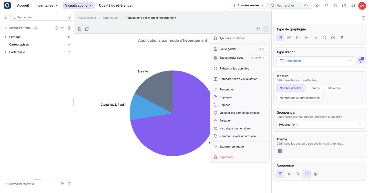
For a presentation, choose Export to image in the same menu. The chart stays up to date in Boldo: export again when the data changes. To show it to someone without a Boldo account, choose Share instead.
Key points
- A chart counts or computes from your assets, and updates by itself.
- Group by splits the result. Each Chart type supports its own grouping options.
- A click on a slice shows the assets behind it.
Go further
- Build a dashboard: put this chart on one page with your key figures and other charts.
- Share with a link: show the chart, always up to date, to someone without an account.
- Charts: every chart type and its settings.