Usage report
The Usage page helps administrators understand how the organization is being used over time.
Use it when you need operational signals such as:
- monitoring adoption
- identifying inactive users
- spotting usage peaks
- understanding how actively the workspace is used
Access
- Click the Organization icon in the navigation bar
- Select "Usage report"
Permissions
This page is only accessible to administrators.
Activity chart
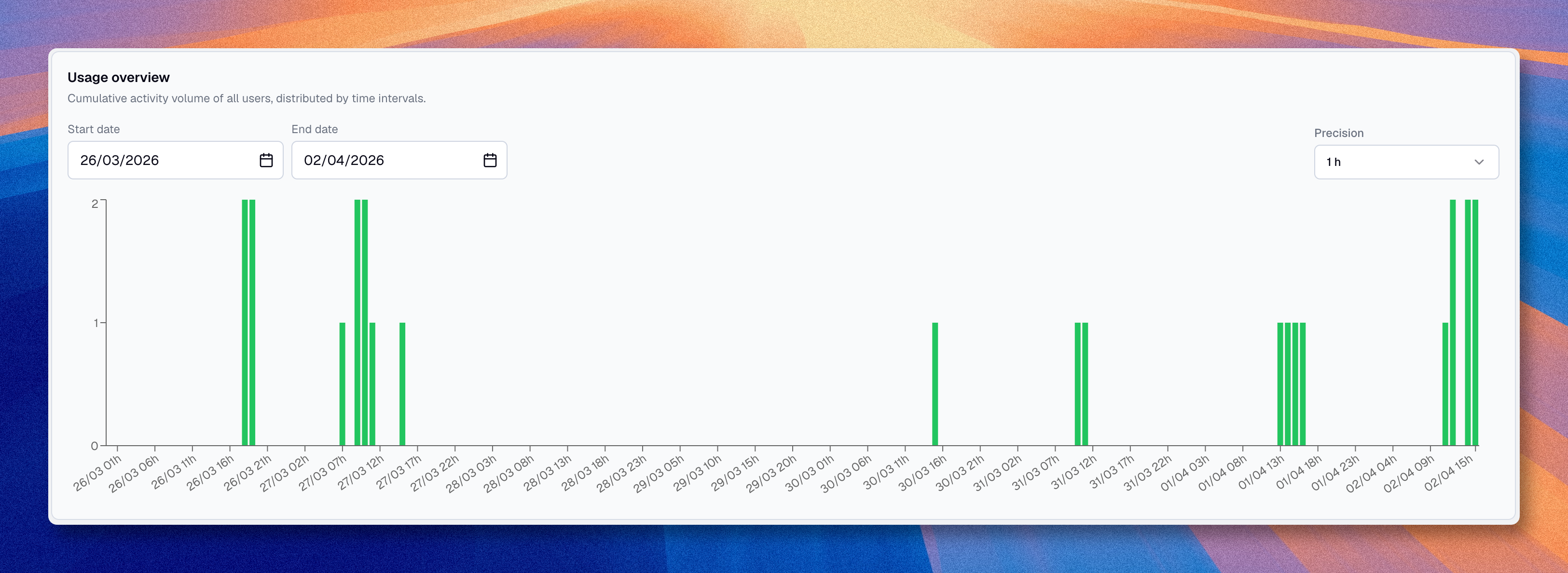
The chart shows workspace activity over time, grouped by intervals.
You can adjust:
| Option | Description |
|---|---|
| Start date | The beginning of the period you want to review |
| End date | The end of the period you want to review |
| Precision | The aggregation step, depending on the selected range |
When you hover over a bar, Boldo can show:
- the date or time for that interval
- the number of active users
- the users active in that interval
User activity table
Below the chart, a table summarizes user activity for the selected period.
| Column | Description |
|---|---|
| User | The member name or email |
| Distinct active periods | The number of intervals in which the user was active |
| Activity duration | The estimated connection time during the selected period |
This helps distinguish between users who only log in occasionally and users who actively work in the workspace.
Use cases
| Need | How to use |
|---|---|
| Monitor adoption | Review the chart over several weeks |
| Identify inactive users | Look for users with very low activity duration |
| Check rollout impact | Compare activity before and after a deployment or onboarding effort |
| Understand peak usage | Look for high-activity periods in the chart |
What this page does not tell you on its own
Usage data is helpful, but it is not the same as business value.
For example:
- a short session can still be useful
- a user can consume shared diagrams or views without creating many assets
- a power user may work in bursts, not continuously
Use this page as an operational signal, not as the only performance measure.