Charts
Charts transform inventory data into analytical visualizations. Use them to summarize distributions, compare categories, track KPIs, or spot trends.
Charts analyze what is already present in the inventory. If the goal is to explain structure or dependencies, use a diagram or a nested map instead.
Access
- Click "Charts" in the navigation
- The catalog displays on the left
- Select an existing chart or create a new one
Create a chart
- Click "+" in the catalog
- Select "New chart"
- Configure the chart
- Name and save
A simple mental model
To create a chart, you choose:
- an asset type to analyze
- a Group by property (how data is categorized)
- an aggregation (what is measured)
- optional filters
Charts are the analytical layer of the knowledge base.
Chart types
Pie
Shows composition or distribution of a single group.
Typical use: applications by status.
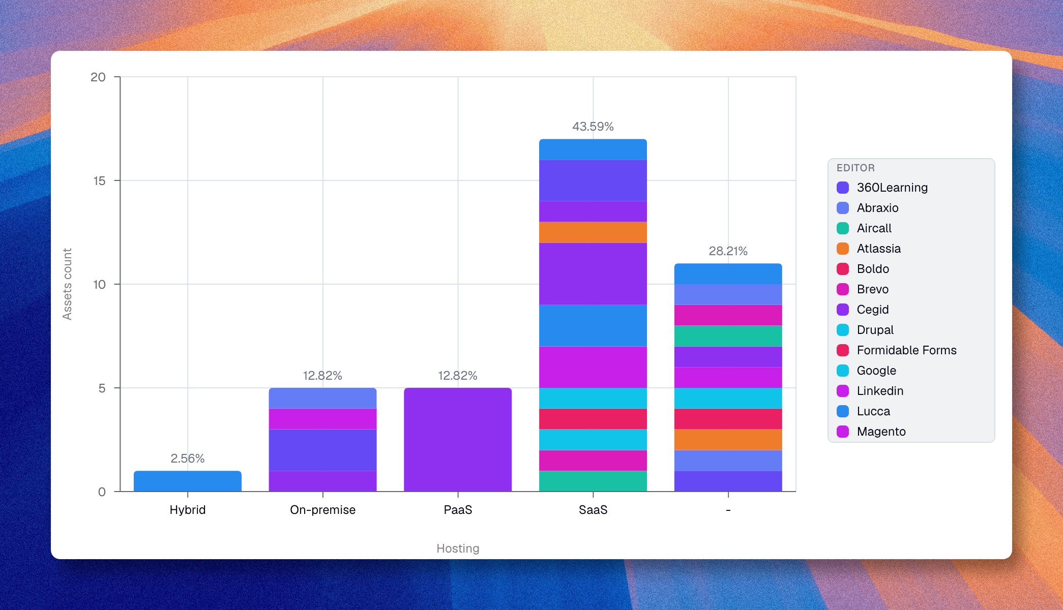
Bar
Compares categories directly. Supports a breakdown dimension for stacked or grouped bars.
Typical use: applications by responsible team.
Bubble
Positions items across two meaningful axes with an aggregation.
Typical use: a portfolio mapped by two numeric properties.
Line
Displays trends along a continuous X axis (number, score, percentage, currency, or date). Supports a breakdown dimension.
Typical use: cost evolution over time.
Area
Same as line but fills the space below curves. Same X-axis restriction. Supports a breakdown dimension.
Typical use: cumulative headcount by department over time.
Radar
Plots values across three or more axes from a center. Requires at least three data points. Single group only, no breakdown.
Typical use: maturity scores across capability areas.
Gauge
Shows a fill proportion against a total. Has a dedicated gauge filter for the measured portion. No group-by property.
Typical use: percentage of applications migrated to the cloud.
Metric
Displays one large number (KPI). No group-by property. Configure "Display name" and "Display description" to add context below the number.
Typical use: total number of active applications.
Core configuration
Data source
- Select the asset type to analyze
- Apply filters if needed
- Review the resulting dataset
Group by
Choose the property or relationship that categorizes data.
- A primary Group by defines the main axis or segmentation.
- An optional Breakdown adds a second grouping level (bar, line, and area charts).
Aggregation
Select the aggregation type first:
- Count -- counts all matching assets. No property selector needed.
- Sum -- totals a numeric property. A "Measured property" selector appears.
- Average -- averages a numeric property. A "Measured property" selector appears.
- Unique values -- counts distinct values. A "Measured property" selector appears.
Sum and Average are disabled when no numeric property exists on the selected asset type.
Filters
Filters narrow the chart to a subset of the inventory. Open them with the filter button next to the asset type selector.
See Filters for the full list of operators, filter targets, and how to combine conditions with groups.
Drilldown
Click any data point (bar, slice, dot, line point) to open a panel listing the underlying assets. The panel includes search and infinite scroll. Click an asset name to open a preview panel on the right without leaving the chart.
Display options
Toggle buttons sit directly in the chart toolbar:
- Display categories -- show or hide group labels
- Display values -- show or hide aggregation labels
- Swap axes -- switch X and Y (bar charts)
- Legend, percentages, and axis labels
Themes
Open the theme picker from the toolbar to choose from the available chart themes, including the default auto theme and several color palettes.
Save and export
- Save the chart and place it in the right folder
- Reuse it from the catalog when needed
- Use the download action to export the chart as an image
Use cases
| Analysis | Type | Configuration |
|---|---|---|
| Distribution by criticality | Pie | Applications, Group by: Criticality |
| Applications by team | Bar | Applications, Group by: Responsible Team |
| Costs by domain | Bar | Applications, Group by: Domain, Sum(Cost) |
| Positioning by two properties | Bubble | Two group-by axes + aggregation |
| Cost trend over quarters | Line | Applications, X: Quarter, Sum(Cost) |
| Headcount by department over time | Area | People, X: Date, Breakdown: Department |
| Maturity across capabilities | Radar | Capabilities, Group by: Area, Average(Score) |
| Cloud migration progress | Gauge | Applications, gauge filter: Cloud = Yes |
| Total active applications | Metric | Applications, Count |